
Rotten Tomatoes Movie Page
A case study done on the Rotten Tomatoes movie page to address key user pain points, such as cluttered information and poor navigation.
Team
Johanna Lee - UX Designer
DELIVERABLES
Interactive Prototype
Year
Spring 2025
Role
UX Designer
I Introductions
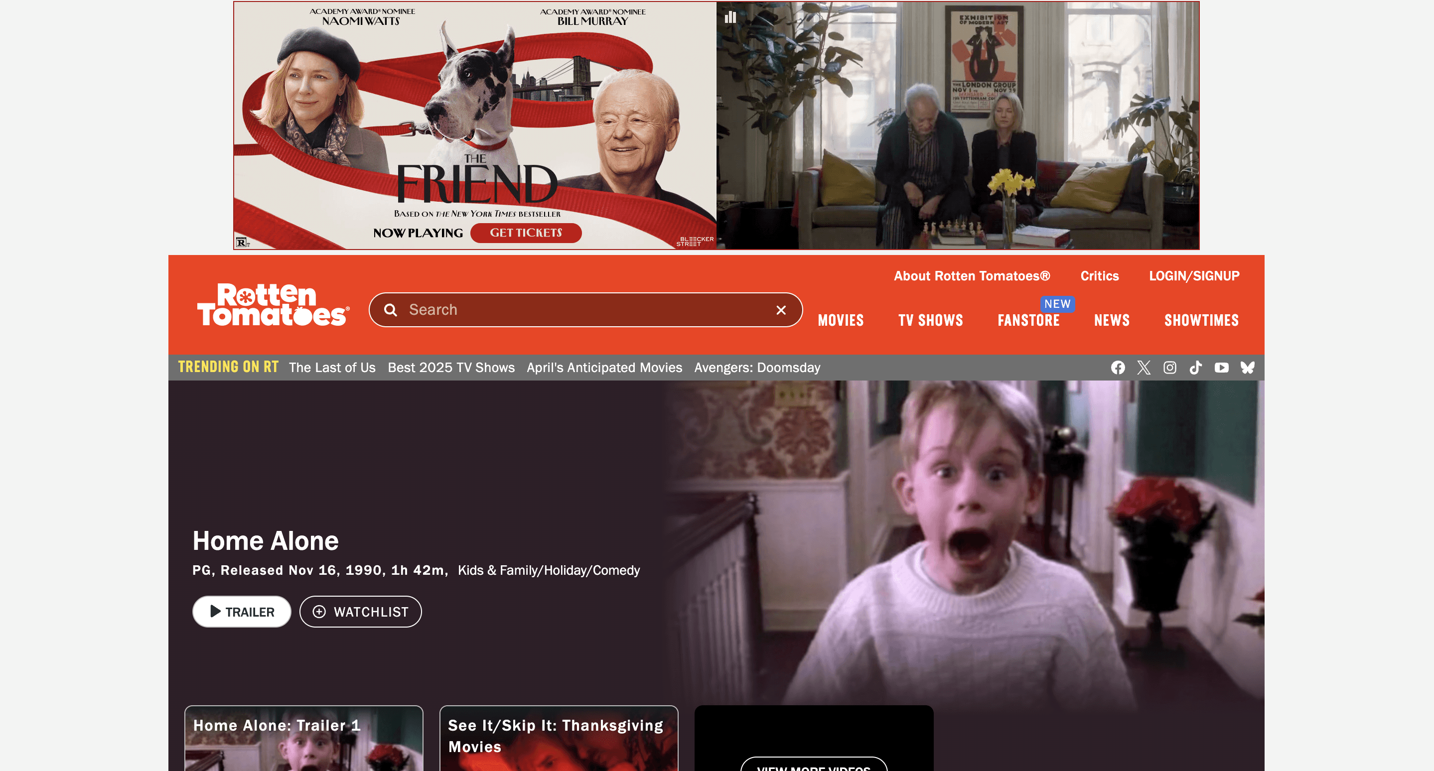
Rotten Tomatoes
As a film lover and frequent Rotten Tomatoes visitor, I undertook a two-day case study to redesign their movie page. I addressed key pain points like clutter and navigation through a user-centric layout, a colorful design system, and prioritized user ratings.
II Research
UX AUDIT & SWOT ANALYSIS
I conducted a UX audit of the current Rotten Tomatoes movie page and synthesized my findings as a SWOT analysis table.
 |  |
Strengths
| Weaknesses
|
|---|---|
Opportunities
| Threats
|
COMPETITOR ANALYSIS
During the competitor analysis stage, I audited 3 other movie review sites identifying each competitor's user flow, branding, and positioning within the market.
Competitor 1: IMDb (Internet Movie Database):
→ a comprehensive online database for films, television, and celebrities, including user ratings, reviews, and detailed production information
User Flow
The movie page prioritizes visual content, such as posters, trailers, photos, and videos, occupying the majority of the initial landing frame real estate
Greater emphasis on delivering digestible factual information about the film
Brand Identity
Minimal visual branding with a simple logo and yellow as its only primary accent color
Lack of distinctive iconography or visual elements
Market Positioning
IMDb positions itself as a source for official, factual information on films, prioritizing data provision over user interaction or collecting viewer reviews
Competitor 2: Letterboxd:
→ a social networking site for film enthusiasts to track, rate, review, and discuss movies
User Flow
Disruptive advertisements frame the screen while users navigate the movie page
Prioritizes community interaction through conversation dashboards
Information architecture and organization are inconsistent - excessive use of tags
Brand Identity
Minimal visual branding with a simple logo and limited accent colors
Lacks distinctive iconography and prominent visual elements.
Market Positioning
Letterboxd positions itself as a community-driven platform, facilitating discussions and debates among film critics and enthusiasts
Competitor 3: Metacritic
→ a collection of reviews from expert critics for movies, music, TV shows, and video games
User Flow
Prioritizes critic and user reviews and ratings, offering limited general information about the movie itself
A significant portion of the page is dedicated to displaying critic comments and the summarized rating score
Brand Identity
Consistent branding with three primary colors
Market Positioning
Metacritic establishes itself as a trusted source for professional critic reviews and ratings, emphasizing the reliability of expert opinions
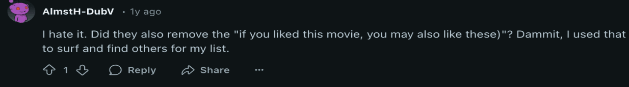
MEDIA REVIEW
Due to time limitations, I utilized Reddit threads to simulate user research for Rotten Tomatoes' updated layout. This analysis yielded feedback comparable to that from traditional UX interviews and surveys.
  |   |
|---|
Key Sentiments:
Users appreciated the clear, table-based presentation of general movie information in the past UX, allowing for quick access upon landing on the movie page
The current layout requires unnecessary steps to get to the primary user goals of reading/submitting reviews and viewing scores, due to poor visibility and organization
The "You May Also Like" section is now excessively buried, requiring extensive scrolling
Overall, users experience frustration from excessive scrolling to find key information
RESEARCH SYNTHESIS
Key Pain Points
[Opportunity to Differentiate] Emphasize user ratings and reviews in the UX layout to position Rotten Tomatoes as the premier viewer-driven rating platform, enhancing credibility.
[Opportunity to Differentiate] Implement a consistent, colorful, and playful design system to stand out from competitors with minimalist branding.
Improve information and typography hierarchy to enhance user comprehension and reduce scrolling.
Prioritize access to general movie information and the 'More Like This' section
Enhance user navigation through clearer organization of the header, footer, and iconography
III Design
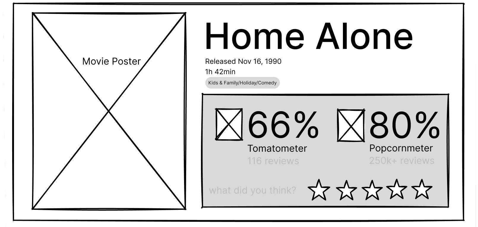
Wireframing - Round 1
Based on the key pain points from the Research and Analysis phase, I created wireframes to solve each pain point.
 |
|
|---|---|
 |
|
  |
|
User Interview
I conducted 5 usability interviews to test the initial low-fidelity prototype and identify remaining pain points. 2 were avid film watchers and rotten tomatoes users and 3 were novice users.
Key Feedback:
Movie Poster Dominance → the movie poster occupies excessive space on the landing page.
Information Organization → The information organization is generally well-received.
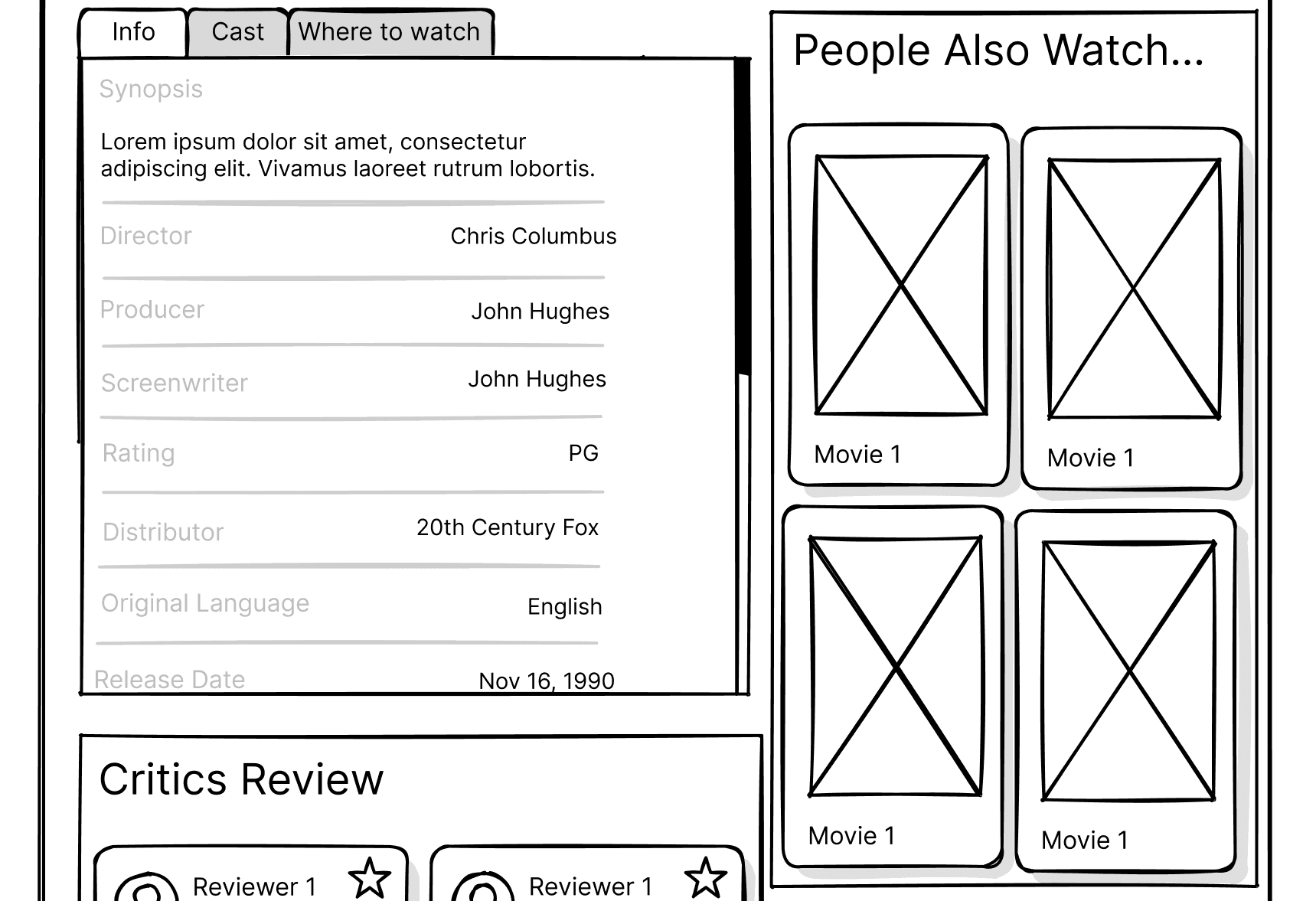
"People Also Watch" Section → Users want the "People Also Watch" / "More Like This" section to be positioned higher on the page for immediate interaction, as it directly aids users who are looking to decide on a film to watch.
[PERSONAL FEEDBACK] There needs to be more consideration of the advertisement placements. Though ads are disruptive, they are used for revenue.
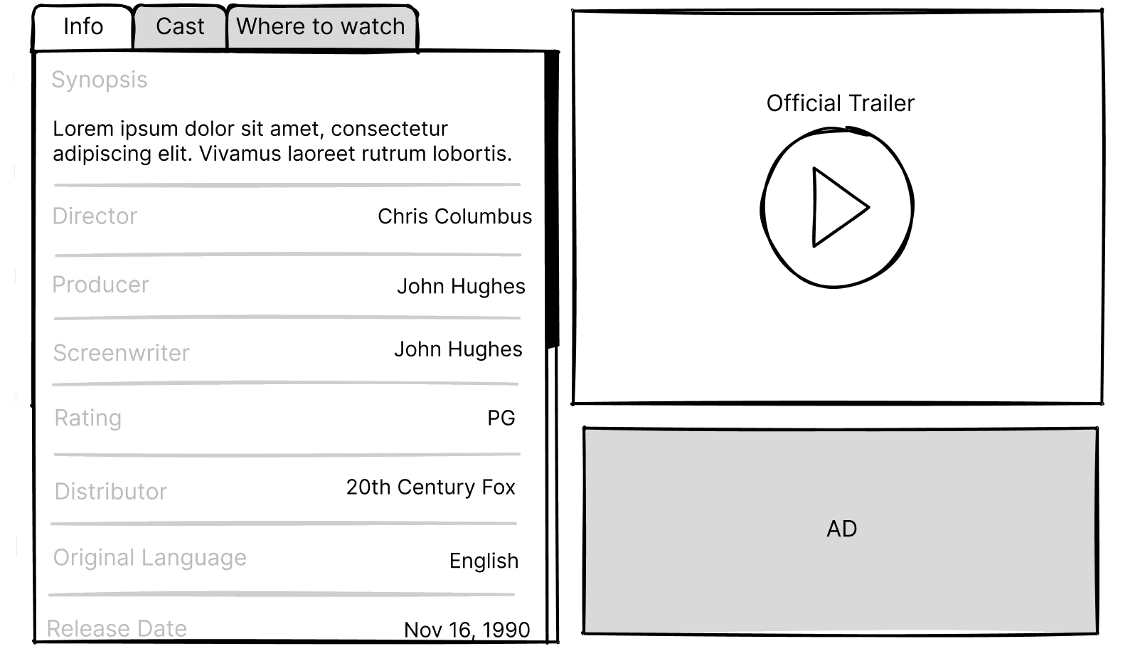
WIREFRAMING - Round 2
Based on the feedback, I revised the wireframes to address the identified issues.
Pain points to Solutions
 |
|
|---|---|
 |
|
 |
|
Design System
From the low-fidelity prototypes, I identified essential components and created interactive Figma components for efficient prototyping. I also sourced branding information from Pentagram’s article on their rebranding project for Rotten Tomatoes.

High-Fidelity Prototype
With the Figma components in place, I proceeded to create the high-fidelity prototype, focusing on using more colors to enhance the UI's playful branding.
IV Reflection
EVALUATION
To assess the effectiveness of my Rotten Tomatoes redesign, I used the four key pain points from the research phase as evaluation criteria, outlining strengths and areas of improvement.
Pain Points | Solution Evaluation |
[Opportunity to Differentiate] Emphasize user ratings and reviews in the UX layout to position Rotten Tomatoes as the premier viewer-driven rating platform, enhancing credibility. | I successfully prioritized user ratings and reviews, encouraging users to interact and submit their own ratings. I wonder if there is a more integrated design for the trailer and rating placement that could avoid video overlay. |
[Opportunity to Differentiate] Implement a consistent, colorful, and playful design system to stand out from competitors with minimalist branding. | I implemented a more colorful design system to establish a playful brand identity, balancing vibrancy with a cohesive user interface to differentiate from competitors with more minimalistic branding. |
Improve information and typography hierarchy to enhance user comprehension and reduce scrolling. (Prioritize access to general movie information and the 'You May Also Like' section) | Based on user feedback (from Reddit and wireframe feedback), I repositioned key information, including general movie details and the 'More Like This' section, to the immediate second scroll for improved accessibility. |
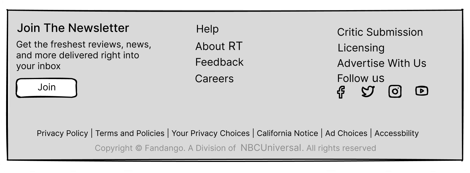
Enhance user navigation through clearer organization of the header, footer, and iconography | Header and footer navigation were successfully simplified. If I had more time on this project, I would focus on enhancing icon clarity and accessibility, addressing the current reliance on the 'About' page for icon explanations. |
Due to time limitations, this project reflects a condensed research and design cycle. With more time, a more thorough UX research phase (proper usability interviews and user surveys) and further design iterations would have been conducted.